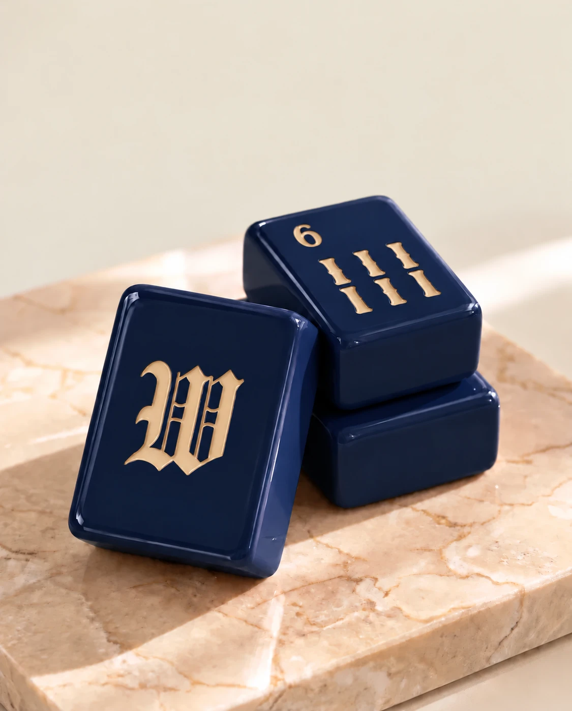

A good-looking set can be hard to read if the markings and tile body are too close in tone. If a recipient plays in the evening, check the view under ordinary indoor light before choosing a design.
Look from more than one seat
A close-up photo may flatter the markings. Ask for a picture of several tiles together under normal lighting, then imagine how they look from across the table.
Make readability a preference, not a surprise
If the recipient has a set they read comfortably, ask what they like about it. Use the answer when comparing Mahjoon's final specifications and available colorways.