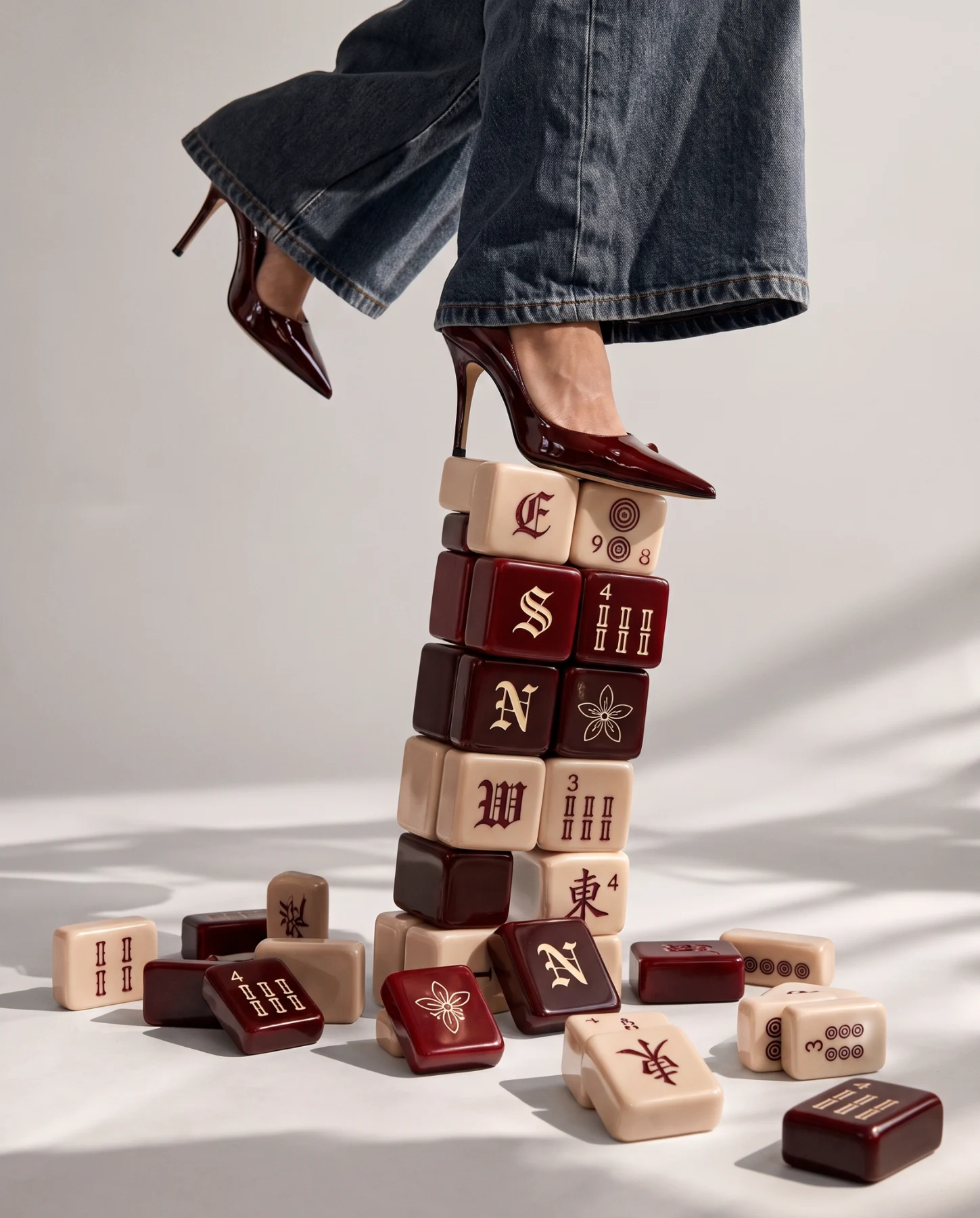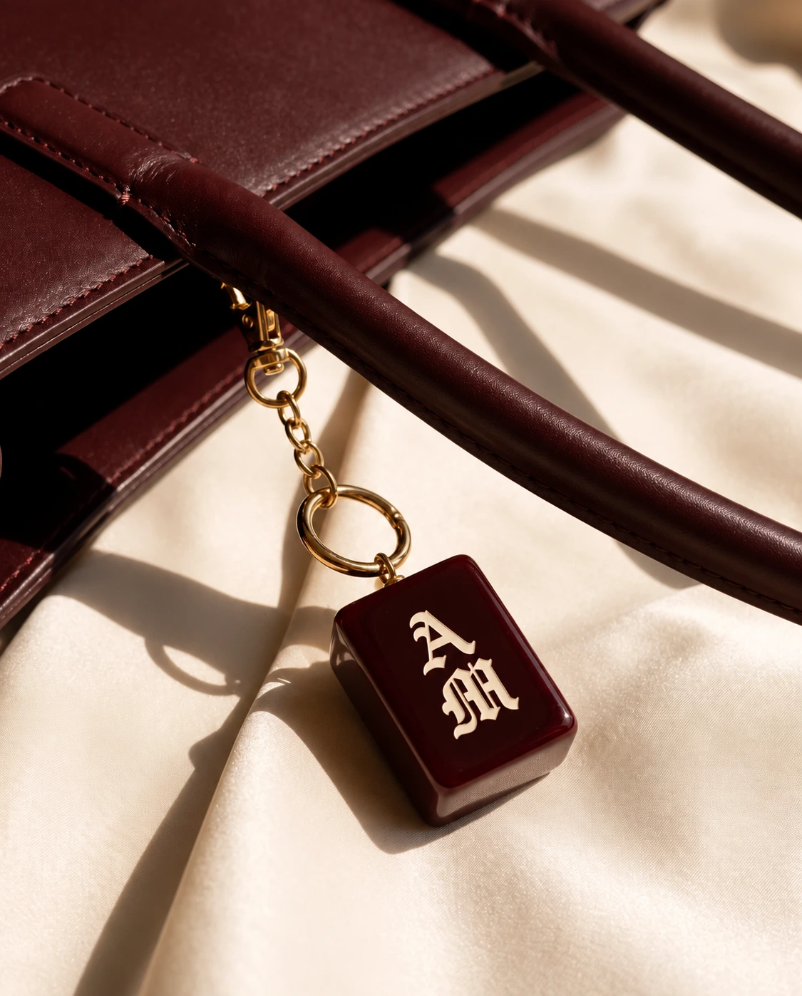
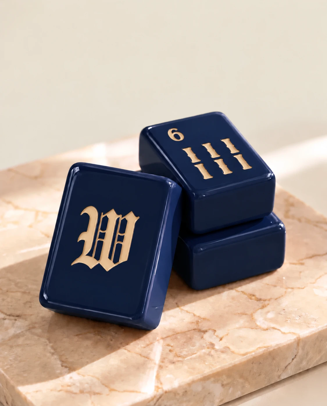
There is no personality test hidden in choosing a Mahjong set. You can love a color because it belongs in your home, because it reminds you of a favorite object, or simply because it makes you want to play. Here is how we think about Mahjoon’s four debut colorways.
Cherry Glaze and Espresso
Cherry Glaze is our deep oxblood, paired with Champagne-colored lettering. It is the collection’s most expressive warm shade, with a glossy surface that catches the light. If you like burgundy leather, rich reds or a focal point on an otherwise quiet table, it is a natural place to start.
Espresso is dark brown with Champagne-colored lettering. It brings depth while remaining a neutral. Compare it with the furniture and lighting where you normally play: a dark set can look different against pale stone than it does against a dark wooden surface.
Champagne and Moonlight
Champagne is warm beige with Cherry Glaze lettering. It provides the lighter option in the debut palette, with darker markings that give the face definition. If you prefer soft neutrals, it is worth seeing alongside the darker sets rather than judging it in isolation.
Moonlight is navy with Champagne-colored lettering. Its cooler tone balances the warmer shades, and offers an alternative for someone drawn to blue. We use Moonlight as its colorway name; midnight blue describes the mood, rather than a separate fifth color.
Look beyond the screen
Photography, screen settings and room lighting affect color. The website images communicate the design direction; approved physical samples will set the production reference. If exact matching matters to you, wait for final product photographs and specifications before making a purchase decision.
For a gift, asking the recipient to choose can be a pleasure rather than a compromise. For your own set, consider the space where it will be used and whether you prioritize a light face or a darker body. Join the waitlist to hear when the debut collection is ready for pre-orders and the final details are available.