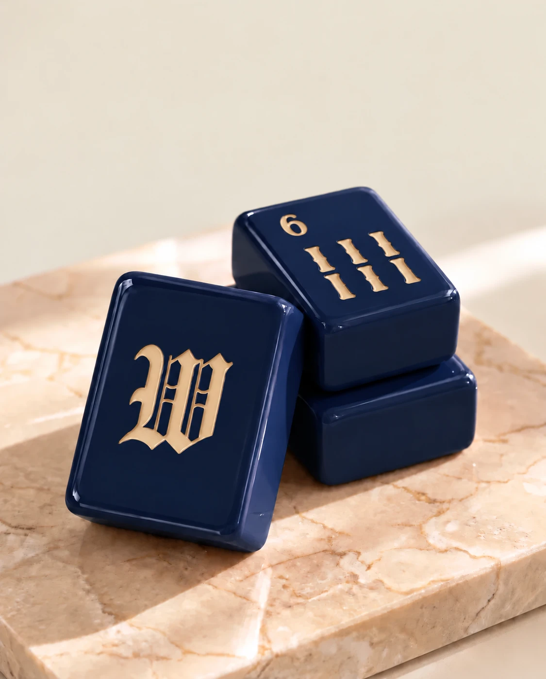
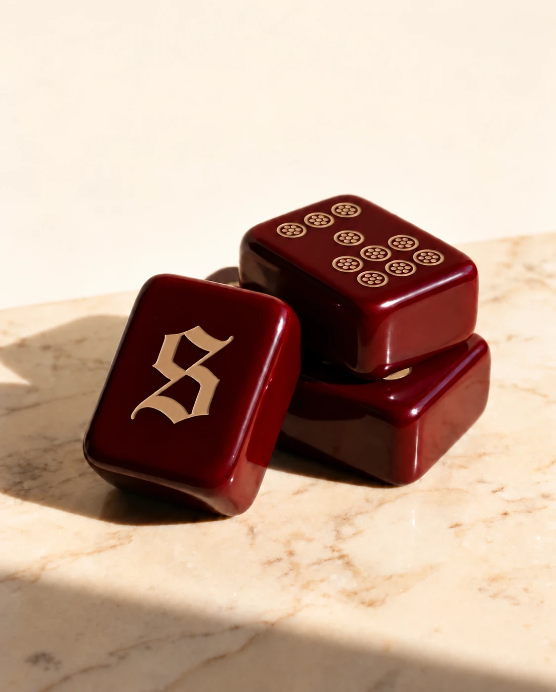
If the recipient prefers warm neutrals, consider how much contrast they want at the table. A dark neutral can sit quietly against wood, while a lighter face may feel more at home in a bright room.
Compare the whole palette
Look at the tile body, lettering and other visible components together. Espresso and Champagne are distinct directions in Mahjoon's design preview, and availability will be confirmed with the collection.
Buy for their light
Ask whether they play by a window or under lamps. The final sample or photos under ordinary lighting will be more useful than a heavily styled image for judging legibility.